
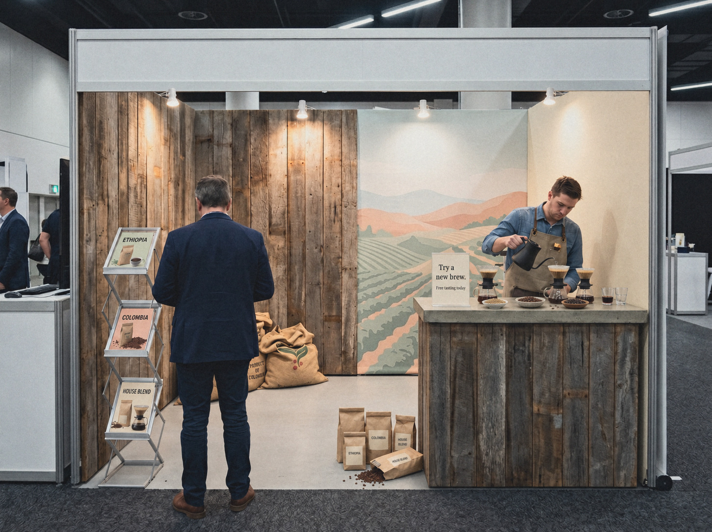
A trade show stand has to communicate in stages. Most visitors will not stop and read everything, so the space needs to make sense from a distance first, then reveal more detail as someone moves closer. The first question is what a person should understand from the aisle. That message should be simple enough to grasp in a few seconds and broad enough to explain the purpose of the stand. A company logo on its own is rarely enough for people who do not already know the brand, so it is usually more useful to state the product category, service or problem being solved in plain language. Position matters as much as wording: the main message should sit high enough to remain visible when the stand is busy, because graphics that look perfectly clear during setup can quickly disappear behind people, furniture, screens and product displays once the hall fills.
After that, the information can become more detailed. A useful way to plan the stand is in three layers: what can be understood from the aisle, what can be read from the edge of the stand, and what is only relevant once someone is standing at the counter. This creates a natural hierarchy and avoids the common mistake of making every message compete for attention at the same size. It is much the same principle used in commercial interiors, where spaces work better when different areas have clear purposes. The back wall can carry the broad message, the front edge can introduce product groups or demonstrations, and the counter can hold the practical detail such as pricing, product information, brochures and QR codes.
Printed brochures still have a place at trade shows, particularly where visitors need specifications, dimensions, installation information or product comparisons they may want to review later, but they need to be displayed properly. Literature laid flat on a counter is easily covered by laptops, bags, coffee cups and samples, and it becomes difficult to see once people gather around. Bringing brochures upright makes them easier to scan and also frees up the work surface. A portable concertina stand is useful because it creates vertical display space and folds down again for transport, whether that means a smaller A4 x 4 format for a compact stand or a larger A4 x 6 or A3 x 6 format for broader ranges. The important point is not to fill every available pocket simply because it is there. Too much printed material creates the same problem as too much signage: the visitor has to work too hard to understand what matters.
QR codes have changed the role of printed material rather than replaced it. A brochure can provide the overview while detailed specifications, installation guides, videos or full catalogues sit online, but the code itself needs to explain why it is worth scanning. “Scan here” does not tell the visitor much; “Download the catalogue”, “View product specifications” or “See installation examples” is clearer. Placement matters as well. Codes should be easy to reach with a phone, large enough to scan comfortably and kept away from reflective surfaces or clutter. Just as importantly, the page behind the code needs to work well on mobile, because most people will be opening it on a phone while standing in the exhibition hall.
Countertop signage is best used for information that changes from event to event. Prices, product launches, competition details, seminar times and demonstration schedules are often better handled with replaceable inserts than permanent graphics. This keeps the main stand design cleaner and makes the display easier to reuse. Clear sign holders work particularly well because they do not add another strong visual element, and double-sided holders are useful where people may approach a counter from more than one direction. The broader lesson is that temporary information should remain temporary; it does not need to be built into the permanent visual language of the stand.
Small stands need especially careful planning because floor space disappears quickly. A 3 x 3 metre booth can feel generous on paper, but once it contains a counter, product samples, two staff members and a few visitors, circulation becomes tight. Adding more furniture usually makes the problem worse, so vertical display is often more useful. Brochure stands, rotating literature holders and freestanding sign-and-brochure units can move information off the counter and help keep the floor area clear. The aim is not to fit in as much as possible, but to make the space comfortable to enter, easy to understand and simple to move through.
It also helps to think of the stand as an interior rather than simply a piece of advertising. Contemporary commercial spaces are generally becoming calmer and more resolved, with greater attention to materials, lighting, texture, circulation and negative space. A trade show stand benefits from the same restraint. That does not mean it needs to be minimalist, but each element should have a reason to be there. Signage, samples, literature and furniture should feel like part of one environment rather than a collection of separate marketing pieces. If the stand uses warm timber, soft neutral finishes or a restrained architectural palette, display equipment should support that rather than compete with it.
One of the most common mistakes is trying to explain the entire business on the stand. Visitors rarely have the time or inclination to process that much information at once. A clearer approach is to show the main offer first, then allow interested people to move into more detail through brochures, product displays, conversations or digital links. Good signage should also reduce the amount of basic explanation staff need to repeat, allowing visitors to orient themselves while the team is busy. Clear product names, brochure categories and simple supporting information can all help people understand what they are looking at without needing immediate assistance.
Practical details matter too. Reusable display equipment is usually more useful than event-specific hardware because sign holders, brochure stands and modular pieces can move between exhibitions, showrooms, launches and office events while the printed inserts change around them. That makes transport and storage part of the planning process. Clear acrylic and plastic can scratch easily under bright exhibition lighting, so holders should be separated or wrapped before packing. Collapsible brochure stands should travel closed, printed inserts are best kept flat in a rigid folder, and spare copies are useful in case something is damaged or changed at short notice.
The best place to start is with the floor plan. Mark the main approach direction, the product display area, where staff will stand, where conversations are likely to happen and where visitors may pause. Then decide what information is needed at each point. A small booth may only need one strong wall message, one brochure display and a countertop sign, while a larger stand with several ranges may need separate information zones and multiple literature points. The amount of signage should follow the layout, not the other way around. The most effective trade show signage is usually the signage that helps people understand the stand without making them think about where to look next.