
7 ways to display brochures in a waiting room

Waiting rooms have changed a lot in the past few years. The old formula of identical chairs, a coffee table full of magazines and a brochure rack in the corner is giving way to spaces that feel more considered, more comfortable and often more like a hotel lounge or residential interior than a traditional reception area.
That change is part of a broader shift in office and healthcare design. In 2026, more attention is being paid to how people actually experience a space: whether they can find their way around easily, whether they have somewhere quiet to sit, whether the lighting is comfortable and whether the room feels calm rather than cluttered. Brochure displays are only a small part of that picture, but they can either support the room or work against it.
For clinics, offices and service centres, the best displays tend to be the ones that are easy to understand at a glance and positioned where people naturally spend time.
1. Start from the chair, not the reception desk
One of the simplest ways to improve a waiting room is to sit in it. From the chair, look at what a visitor actually sees. The empty wall beside the front door might seem like an obvious place for brochures when you are standing behind reception, but a person coming through the entrance is usually thinking about checking in, finding the right room or whether they are late. They are not usually in browsing mode.
The better positions are often beside the seating area, opposite the chairs or near a place where people naturally pause. In healthcare settings, this fits with the broader idea of wayfinding, where signs, landmarks, colour, information and the physical layout all work together to make an unfamiliar environment easier to understand.
If there is one particularly important brochure, such as a patient guide or information about a key service, reception can still be the right place for it. A simple clear holder such as the A4 Portrait Brochure Holder (77001) keeps it visible without covering the desk in paper.
2. Keep the reception counter doing its real job
Reception desks already have enough to deal with. Depending on the business, they may be handling check-ins, deliveries, payments, visitor passes, phones and private conversations. Adding a dozen brochure holders rarely improves the situation.
One of the more noticeable changes in contemporary reception design is the move towards cleaner counters and fewer loose objects. Technology is increasingly integrated into joinery, cables are hidden and the visual clutter that used to collect around reception is being reduced. That does not mean removing every brochure. It means deciding what genuinely belongs there.
Keep the most requested or most useful item on the desk and move the rest to a wall or separate information point. In a clinic, that might mean leaving a patient form or service guide at reception while health information and community resources sit elsewhere.
3. Use wall space when you have a real collection
Once a practice or office has more than a handful of brochures, the counter stops being the right place for them. A wall display makes it easier for visitors to scan several titles at once and gives staff a chance to organise material properly. A medical practice might separate information into services, preventative health, forms and local support resources. A council office might group material around permits, community programs and local services.The arrangement matters more than simply filling every pocket.
A mixed-format display such as the Lit-Loc A4 x 4 and DL x 8 (WD1101) can work well because detailed A4 documents and smaller take-away leaflets can sit together without forcing everything into the same format.
Wall mounting also frees up furniture, which fits with the broader move towards less cluttered waiting spaces. In smaller interiors especially, getting paper and display hardware off tables can make the room feel noticeably calmer.
4. Design around different kinds of waiting
Not everyone waits in the same way. Some people sit for five minutes and scroll through their phone. Others may be there for half an hour, reading, filling out forms or keeping an eye on children. In a corporate reception area, one visitor may be waiting for a meeting while another is working on a laptop.
This is why zoning has become such a strong feature of workplace interiors. Instead of treating a room as one uniform space, designers are creating busier areas, quieter areas and places intended for different kinds of activity. Brochure displays can follow the same logic.
Information that somebody might want to read properly can sit closer to the quieter seating. Forms and frequently requested documents make more sense near reception. A large display does not automatically need to sit in the centre of the room just because that is where everyone can see it.
5. Let the brochure format suit the job
A4 and DL brochures serve different purposes, and there is little value in forcing everything into one size for the sake of visual consistency. A4 is useful when the reader needs detail. That might include instructions, service information, diagrams or forms. DL works better for shorter material that someone can quickly pick up and take away. The useful question is not which format looks best in the rack. It is what the reader needs to do with the information afterwards.
If a brochure has been squeezed into tiny type simply because all the available pockets are DL, the problem may be the display rather than the brochure. Good design should make information easier to use, not just easier to arrange.
6. Leave some space empty
One of the more interesting shifts in office interiors is the recognition that empty space is useful. Not every wall needs artwork. Not every table needs an object on it. Not every corner needs to be filled. Waiting rooms benefit from the same restraint. A side table with a lamp, plant, magazines and several brochure holders can quickly start to look busy. A wall covered edge to edge in printed material can have the same effect, even if everything is neatly aligned. In a small waiting area, using height is often more effective than adding furniture. Wall-mounted displays are an obvious option, while rotating holders such as the 592804 and 592801 can hold several A4 titles without spreading them across a large surface.
Larger foyers may need the opposite approach. If there is plenty of open floor space but no suitable wall, a freestanding unit such as the Contemporary Floor Display Stand A4 x 6 (693145) can create a clear information point without adding another table or cabinet.
7. Make the display belong to the room
Biophilic design, warmer materials and softer, more residential finishes have been influencing offices and healthcare interiors for several years, and by 2026 they are well established rather than novel. Natural light, timber tones, planting, acoustic surfaces and comfortable furniture are being used to make workplaces feel less institutional. In healthcare environments, the same principles can help create spaces that feel calmer and easier to spend time in.
A brochure display should not fight with that. If a waiting room has been carefully designed with soft finishes, natural light and a restrained colour palette, an oversized rack crammed with mismatched leaflets can quickly become the busiest thing in the room. The answer is not to hide the information, but to edit it and give it some room.
That also means keeping it current. Empty pockets, curled brochures and information that should have been removed months ago make a display look neglected. A quick weekly check is often enough to keep it under control. It can also tell you something useful. If one brochure is disappearing every few days and another has barely moved, that is real feedback about what visitors are interested in.
The waiting room is part of the experience
People form an impression of a business well before they reach the meeting room, consulting room or showroom. A good waiting area makes things easy. Visitors can work out where to go, find somewhere comfortable to sit and get the information they need without having to ask for it. The space feels considered rather than overfilled. Brochure displays are a small part of that, but the same rules apply to them as the rest of the room. Put information where people naturally spend time, give important material more prominence, avoid unnecessary clutter and make sure the display works with the interior rather than simply occupying whatever space was left over.
If that is done well, the brochures tend to do what they were there to do in the first place: get read.
- Published in Instore
A1 vs A2 Poster Sizes: Choosing the Right Size
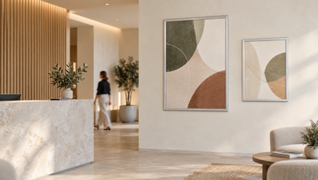
Choosing between an A1 and A2 poster can seem straightforward until the display is placed in an actual room. On a computer screen, the difference between the two sizes may not appear significant. On a wall, however, an A1 poster has twice the surface area of an A2 poster and creates a noticeably stronger presence. The right choice depends on where the poster will be displayed, how far away it needs to be read and how much attention the message should command.
An A1 poster measures 594 × 841 mm, while an A2 poster measures 420 × 594 mm. Both use the same proportions, so artwork can usually be adapted between the two sizes without changing the overall layout. The main difference is scale. A1 is approximately 41 per cent wider and taller than A2, giving it twice the printable area. This makes A1 better suited to messages that need to be noticed across a larger room or from further away.
A1 posters work particularly well in foyers, retail stores, showrooms, exhibitions and busy workplace corridors. Their larger format provides enough space for a strong image, clear heading and a small amount of supporting information. They can be used for major promotions, campaign messages, event information, safety communication or directional signage. An A1 poster can also create a useful focal point in a large reception area where a smaller display may be lost against the surrounding wall or furniture.
The larger size does not mean an A1 poster should contain more wording. In most cases, the additional space is better used to improve visibility. A larger heading, stronger image and more generous spacing will communicate more effectively than several paragraphs of small text. The purpose of using A1 is usually to attract attention from a distance, so the main message should be understood before someone walks closer to read the details.
A2 posters have a quieter presence and are generally better suited to information viewed at a closer distance. They work well in reception areas, consulting rooms, staff facilities, education settings and smaller retail spaces. The format is large enough to be noticed without dominating the wall, making it useful for customer information, workplace notices, menus, timetables, smaller promotions and supporting signage.
A2 can also be a better choice when several related posters need to be displayed together. A group of matching A2 frames can create an organised information area without filling the entire wall. This approach may suit a workplace displaying policies, a clinic presenting patient information or a showroom explaining several product options. Consistent frames, alignment and spacing will help the group feel considered rather than cluttered.
The surrounding space should always influence the decision. A1 may provide the strongest visual impact, but it can feel oversized in a narrow corridor, small office or compact waiting room. A2 will sit more comfortably in these areas and leave enough clear wall space around the display. Before ordering a poster or frame, it is worth marking the dimensions on the wall with removable tape. This gives a much more accurate sense of scale than viewing the size on a screen.
Remember that the stated A1 and A2 measurements refer to the poster insert, not the complete frame. An aluminium snap frame adds a border around the artwork, so the finished display will be larger than the paper size. Allow for the frame profile when measuring the available wall area, particularly when positioning several frames together or working beside doors, furniture and architectural features.
The best way to choose between A1 and A2 is to consider the role of the message. If it needs to attract attention from further away or become a main feature within the space, A1 is likely to be the better option. If the information will be read at close range or needs to sit comfortably alongside other displays, A2 will usually provide enough presence.
Both sizes can work within the same environment. An A1 poster might introduce the main campaign or message, while A2 posters provide supporting information in nearby areas. Used this way, the different sizes create a clear visual order and help people understand which information should be noticed first.
Choosing the right poster size is not simply about filling the available wall. It is about matching the scale of the display to the space, the viewing distance and the importance of the message. When those elements are considered together, the poster becomes part of the environment and communicates clearly without adding unnecessary visual clutter.
- Published in Instore
